heatmap_chart
This function creates a heatmap chart.
heatmap_chart(**kwargs)
Input Variables
| Name | Description | Type |
|---|---|---|
plot_setup | Dictionary for heatmap configuration, including the following keys:
| Dictionary |
dataset | Array-like dataset containing the values for plotting the heatmap | List or array |
Output Variables
| Name | Description | Type |
|---|---|---|
None | The function displays the heatmap on the screen and saves it to the local folder of the script or notebook ( | None |
Example 1
Use the heatmap_chart function to generate a heatmap.
# Data
DF = pd.DataFrame({ 'A1': [random.randint(1, 100) for _ in range(10)],
                    'A2': [random.randint(1, 100) for _ in range(10)],
                    'A3': [random.randint(1, 100) for _ in range(10)],
                    'A4': [random.randint(1, 100) for _ in range(10)],
                    'A5': [random.randint(1, 100) for _ in range(10)]
                  })

# Chart setup
plot_setup = {
    'name': 'figure1-7-1',
    'width': 30,
    'height': 15,
    'mask': False,
    'line widths': 8,
    'color map': 'plasma',
    'line color': 'white',
    'annot': True,
    'annot size font': 12,
    'dots per inch': 600,
    'extension': 'svg'
}


# Data statement
DATA = {'dataset': DF}

# Call function
heatmap_chart(dataset = DATA, plot_setup = plot_setup)
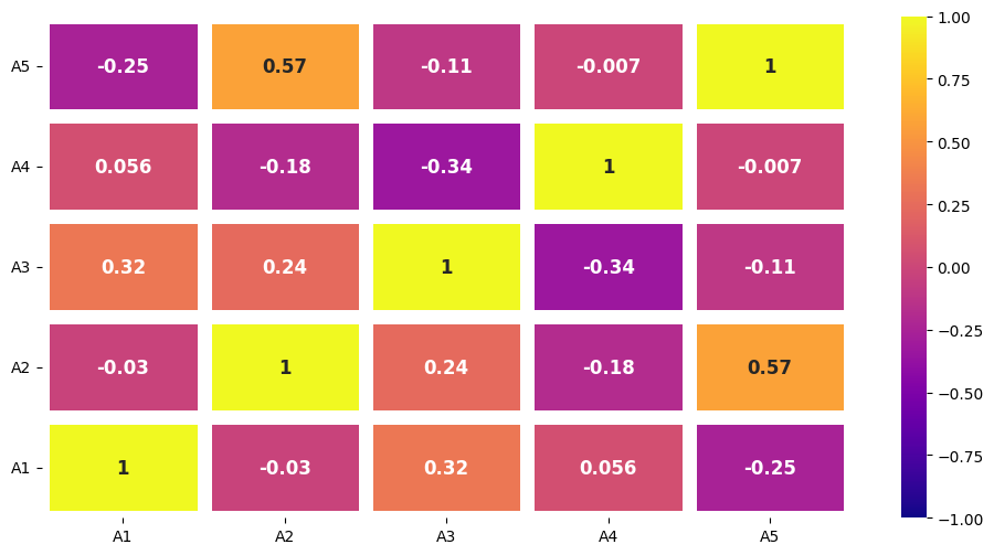
Figure 1. Heatmap of DataFrame Correlation.