scatter_chart
This function shows a scatter chart.
scatter_line_chart(**kwargs)
Example 1
We use the scatter_line_chart function to plot a dataset values and your predict values.
# Data
x = np.linspace(0, 10, 20)
y0 = 2 * x + 1 + np.random.normal(0, 1, 20)
y1 = 3 * x + 1.5 + np.random.normal(0, 1, 20)
y3 = 2.5 * x

df_sc =  {
        'x0': list(x),
        'y0': list(y0),
        'x1': list(x),
        'y1': list(y1)
      }

df_li = {
        'x0': list(x),
        'y0': list(y3)
     }


# Chart setup
setup = {
        'name': 'scatter plot',
        'width': 16,
        'height': 8,
        'dots_per_inch': 600,
        'extension': 'svg',
        'marker_line': [None],
        'marker_size_line': [None],
        'marker_size_scatter': [None]*2,
        'line_width': [1.5],
        'line_style': ['-'],
        'y_axis_label': 'Height',
        'x_axis_label': 'Weight',
        'labels_size': 14,
        'labels_color': 'black',
        'y_axis_size': 14,
        'x_axis_size': 14,
        'axises_color': '#000000',
        'x_limit': None,
        'y_limit': None,
        'chart_color_line': ['blue'],
        'color_map': ['green', 'red'],
        'on_grid': False,
        'y_log': False,
        'x_log': False,
        'legend_line': ['mean value'],
        'legend_scatter': [None]*2,
        'legend_location': 'upper left',
        'size_legend': 12
    }

# Call function
scatter_line_chart(plot_setup=setup, dataset_line=df_li, dataset_sc=df_sc)
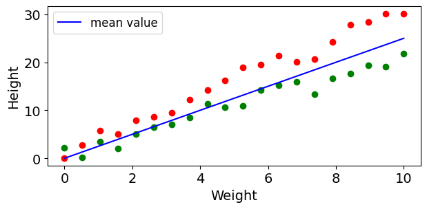
Figure 1. Scatter line chart