multiple_lines_chart
This function creates a line chart with two y-axes, allowing for the display of multiple lines with different scales on the same chart.
multiple_lines_chart(**kwargs)
Input variables
| Name | Description | Type |
|---|---|---|
plot_setup | Setup chart Dictionary with the following keys:
| Dictionary |
dataset | Dataset to plot | List or array |
Output variables
| Name | Description | Type |
|---|---|---|
None | The function displays the plot on the screen and saves it to the local folder of the .ipynb or .py | None |
Example 1
Use the multiple_lines_chart function to visualize multiple lines with two y-axes.
# Data
X = np.arange(0.01, 10.0, 0.01)
DATA_1 = np.exp(X)
DATA_2 = X * np.sin(2 * np.pi * X + 2)
DF =  pd.DataFrame({
                    'x': list(X),
                    'y0': list(DATA_1),
                    'y1': list(DATA_2)
                   })

# Chart setup
CHART_CONFIG = {
              'NAME': 'figure1-10-1',
              'WIDTH': 20.,
              'HEIGHT': 10,
              'MARKER': ['none', 'none'],
              'MARKER SIZE': 2,
              'LINE WIDTH': 2,
              'LINE STYLE': ['-', '-'],
              'X AXIS LABEL': 'time ($s$)',
              'X AXIS SIZE': 12,
              'Y0 AXIS LABEL': 'rpm ($rot \cdot min^{-1}$)',
              'Y1 AXIS LABEL': 'vibration signal ($mm$)',
              'Y AXIS SIZE': 12,
              'LABELS SIZE': 14,
              'CHART COLOR': ['red', 'blue'],
              'ON GRID?': True,
              'LEGEND': ['motor speed', 'vibration signal'],
              'LOC LEGEND': 'upper left',
              'SIZE LEGEND': 12,
              'Y LOG': False,
              'X LOG': False,
              'DPI': 600,
              'EXTENSION': 'svg'
             }

# Data statement
DATA = {'DATASET': DF}

# Call function
multiple_lines_chart(DATASET = DATA, PLOT_SETUP = CHART_CONFIG)
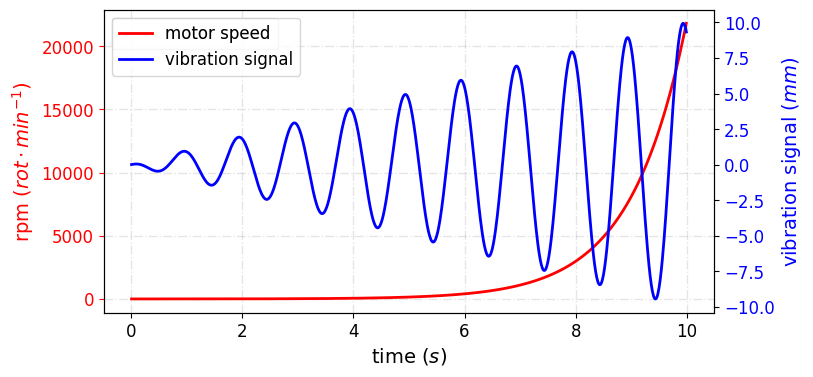
Figure 2. Data Visualization with Two Y-Axes.
```