regplot_chart
This function creates a scatter plot with a regression line using seaborn and matplotlib.
regplot_chart(**kwargs)
Input variables
| Name | Description | Type |
|---|---|---|
plot_setup | Setup chart Dictionary with the following keys:
| Dictionary |
dataset | Dataset to plot | List or array |
Output variables
| Name | Description | Type |
|---|---|---|
None | The function displays the plot on the screen and saves it to the local folder of the .ipynb or .py | None |
Example 1
Use the regplot_chart function to create a scatter plot with a regression line.
# Data
HEIGHT = list(np.random.normal(165, 10, 2000))
WEIGHT = list(np.random.logistic(50, 4, 2000))
DF =  pd.DataFrame({'x': HEIGHT,
                    'y': WEIGHT,
                   })

# Chart setup
CHART_CONFIG = {
        'name': 'figure1-11-1',
        'width': 10,
        'height': 10,
        'marker size': 25,
        'SCATTER color': 'green',
        'line color': 'red',
        'ORDER': 1,
        'x axis label': 'Weight',
        'x axis size': 15,
        'y axis label': 'Height',
        'y axis size': 15,
        'axises color': 'red',
        'labels size': 15,
        'labels color': 'blue',
        'on grid?': False,
        'y log': False,
        'x log': False,
        'dots per inch': 600,
        'extension': 'svg',
    }


# Data statement
DATA = {'dataset': DF}

# Call function
regplot_chart(dataset=DATA, plot_setup=CHART_CONFIG)
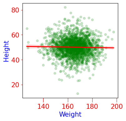
Figure 1. Scatter Plot with Regression Line.