join_hist_chart
This function creates a joyplot (also known as a stacked density plot) using matplotlib and joypy.
join_hist_chart(**kwargs)
Input variables
| Name | Description | Type |
|---|---|---|
dataset | Dictionary containing the data to plot. Must include:
| Dictionary |
plot_setup | Setup chart Dictionary with the following keys:
| Dictionary |
dataset | Dataset to plot | List or array |
Output variables
| Name | Description | Type |
|---|---|---|
None | The function displays the joyplot on the screen and saves it to the local folder of the .ipynb or .py | None |
Example 1
Use the join_hist_chart function to create a joyplot of the dataset.
# Data
import pandas as pd
import numpy as np

# Generating sample data
np.random.seed(0)
data = pd.DataFrame({
    'A': np.random.normal(loc=0, scale=1, size=100),
    'B': np.random.normal(loc=1, scale=2, size=100),
    'C': np.random.normal(loc=2, scale=3, size=100),
})

# Chart setup
chart_config = {
    'name': 'joyplot',
    'width': 10,
    'height': 6,
    'x_axis_size': 12,
    'X axIS color': 'black',
    'dots_per_inch': 300,
    'extension': 'png',
}

# Call function
join_hist_chart(dataset={'dataset': data}, plot_setup=chart_config)
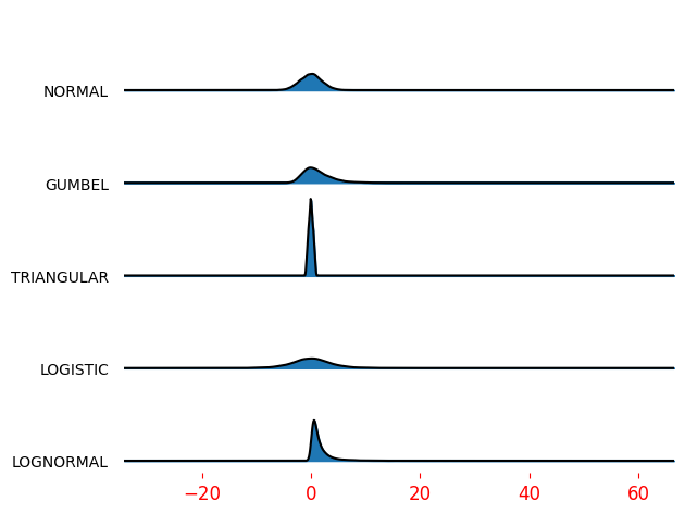
Figure 1. Joyplot of the dataset.